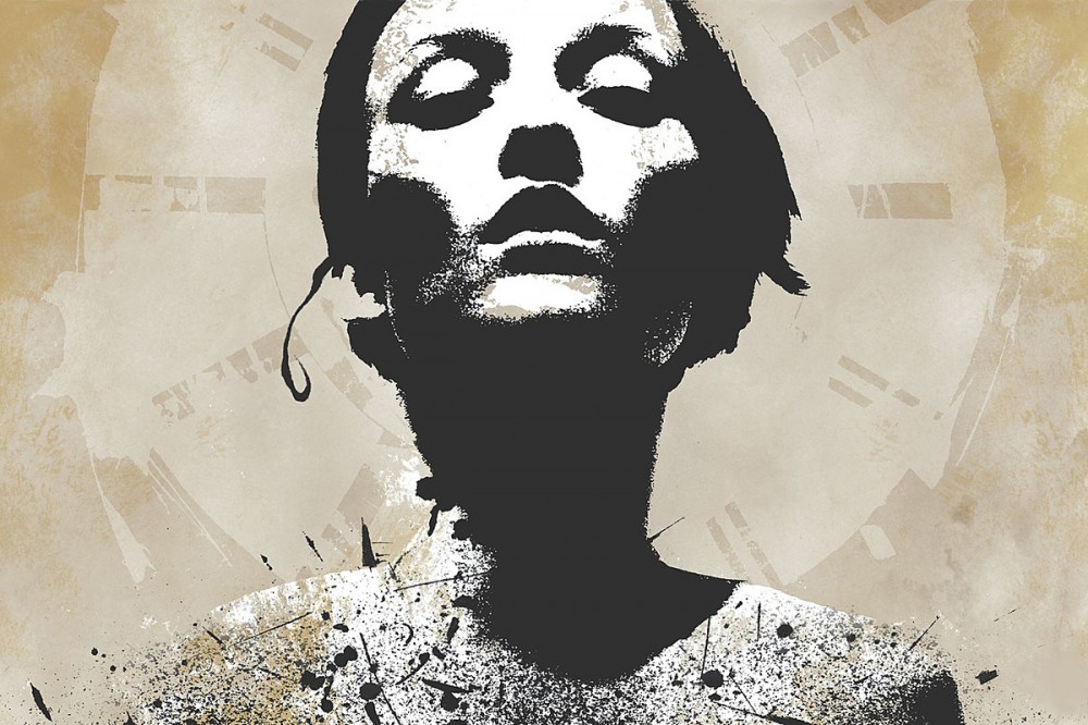
‘Jane Doe’ Model Appears to Have Just Learned of Converge Album Cover, Singer Responds
UPDATE: Jacob Bannon has now commented on the Jane Doe cover model coming forth and his usage of the image for the album cover. In a posting on Facebook, he wrote, "Just to be clear: This is definitely one of the sources for the original stencil/mixed media piece for the Jane Doe album. Most of my work always been collaged cut/paste based (and still is). Hundreds of images were xeroxed and repainted/inked in a loose style to create the release artwork. This process is similar to everyone from Shepard Fairey to Francis Bacon. Over time my work has evolved into something more much more refined, but the roots will always be in this style. I wonder if folks will still insist that it is actually from the cover of Slayer's Reign In Blood? The original goal was to create ghost-like forms that embodied the concept of 'Jane Doe.' In recreation identifiers are removed from physical forms, making all humans become relatable and stoic. We see what we want to see in them, and often times, it's a reflection back onto our own life experiences, etc. Thank you." -J.
Converge may have just connected with the model that appears on the cover of their 2001 album Jane Doe. A social media post by model Audrey Marnay certainly appears to reveal her association with the cover art, but her comments on the post make it seem as though she just learned of the usage.
"Hi Converge, it's 'Jane Doe' Shall we talk?," wrote Marnay on the post which offers a look at the original album art that is a mixed media piece created by Jacob Bannon. The second slide of her Instagram post features the cover that Marnay posed for that appeared on an Italian edition of Marie Claire in 2001 with the same expression and look. According to Marnay, she posed for photographer Jan Welters for the photo that appears on May 2001 edition of the magazine.
When asked about the cover art in a 20th anniversary interview for Decibel that appeared last month, Bannon recalled, "At the time I was going through a great deal of negative in my life. When I was refining the lyrics, it was apparent that the album thematically dealt with that relationship disintegrating. The album was my lyrical purging of that experience. The artwork visually encapsulates that lyrical theme. The visuals attempted to capture the feeling of disintegration and rebirth."
He added, "I spent a great deal of time on that—building figures out of texture and acrylic, scanning multiple layers of imagery, etc. I spent close to a month creating large mixed media pieces for each song on the album. I used a high-contrast approach to the artwork, as it was a style I was growing towards at the time. I felt that the cold iconographic feel was extremely fitting for the subject matter.."
In the Instagram post, one commenter offered, "So you've been an icon of hardcore punk for 20 years and never knew??!!," to which Marnay replied, "Crazy right?"
In the same Decibel interview, Nate Newton stated, "It’s interesting to me how the cover of that record—the Jane Doe face—has become almost iconic in the hardcore scene. It’s almost like the new Misfits skull or something—not that I’d compare us to that, but it blows my mind that we still sell a shitload of Jane Doe shirts. Go to a hardcore show and there’s a good chance you’ll see a kid wearing a Converge shirt, and there’s a good chance it’ll be a Jane Doe shirt."
He continued, "The face doesn’t call to mind anything specific, but at the same time, it’s a strong image that you can put meaning into. I think that’s what makes certain pieces of art powerful—you can look at it and put your own meaning into it. It seemed like during that time period, Jake and Aaron Turner really put the focus back on fine art back into album artwork—at least in this scene. It wasn’t just, 'Here’s a picture of the band, here’s our lyrics, here’s our logo.'”